|
Today, we were asked to complete three logos on Gravit, more specifically, three identical logos with small changes in each one. The first thing I thought of to make a logo of was a seashell. I used the pen tool to make half a seashell, then mirrored it to complete the full shell. Then, I recreated a font (one that I have been using for a long time) with the pen tool, spelling out my name. Since my name is a palindrome, meaning that it spells the same thing from the first letter to the last letter, and vise versa, I was able to mirror the first half of my name to create the second half. However, the 'N' was backwards, and I liked it that way, so I didn't flip it back to a proper 'N.' Finally, I put my name in front of the seashells, each seashell a different color. I think the most frustrating thing that I had to do for this assignment was getting the pen tool to create the small slivers in the shell. Simply zooming in closer to the drawing made this easier. 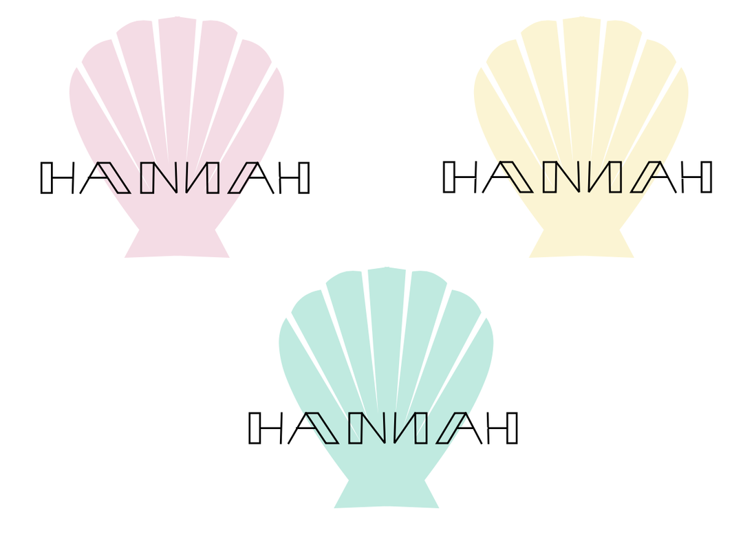 I decided to make this logo because I've always enjoyed going to the beach, and a seashell was the first thing that came to my mind when I thought about the beach. This brand is for all sorts of coastal things, mainly seashells. This logo is a seashell, but not an extremely intricate one. It is simple, but recognizable to be a shell. My favorite logo that I did was the teal one, because it's my favorite color. 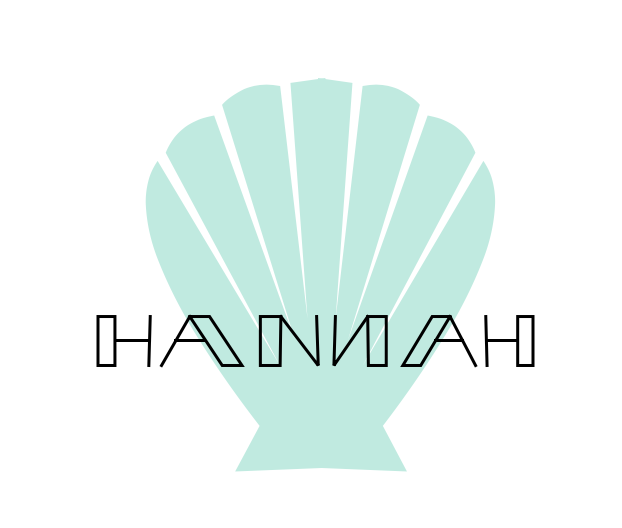
0 Comments
Leave a Reply. |
AuthorHi, I'm Hannah. I'm writing a blog for Technology Class. Archives
May 2021
 This work is licensed under a Creative Commons Attribution-NonCommercial-NoDerivatives 4.0 International License. |
 RSS Feed
