|
The last few classes, we have been learning about typography, which is the visual component of a written word. Typography helps with graphic design, and a design needs to convey a certain message, preferably the most prominent part being larger and standing out. If someone doesn't know about typography, something could be hard to read, or it could give the wrong idea. "Each font has a personality and a purpose." This was a quote that we focused on while learning about Typography, and it means that all fonts have a unique way they look, and a special theme they should be used for. The five types of fonts are serif, sans serif, monospaced, script/handwritten, and display. Serif has "feet" and is usually used in print. Serif is used in newspapers. Sans serif doesn't have "feet" and is used for titles and headings. Monospaced is where each letter takes up the same amount of space, for example, a wide letter like the letter "w" will take up the same amount of space as a skinnier letter, such as the letter "i." Monospaced fonts are used for coding. Script fonts are designed to look like handwriting and are hard to read. Script is used for details and logos. Display fonts are to be used scarcely, and they're flashy and good at catching people's attention. Display fonts are used for posters. typeface COmparison For this assignment, we were told to write the same word or phrase five times, using the five different types of fonts. I used the word "typewriter" and used what I knew about graphic design to align the words. 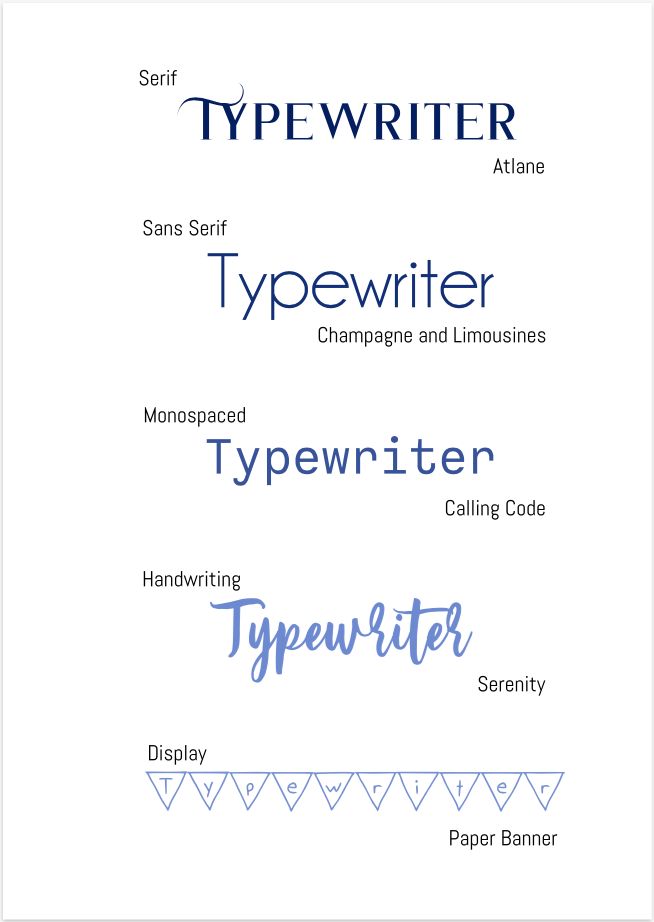 word portraits This assignment was to use different fonts that show different "personalities" and find two words for each font, one that fit the font, and one that didn't. There were a total of 10 fonts and 20 words. 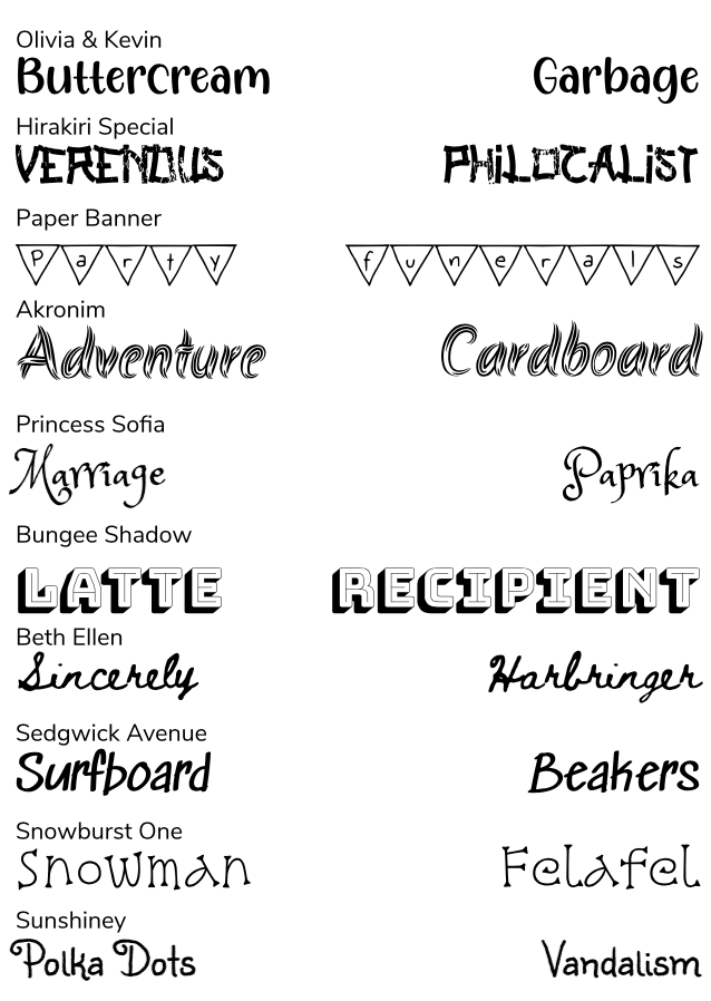
0 Comments
|
AuthorHi, I'm Hannah. I'm writing a blog for Technology Class. Archives
May 2021
 This work is licensed under a Creative Commons Attribution-NonCommercial-NoDerivatives 4.0 International License. |
 RSS Feed
