|
Today, we were asked to complete three logos on Gravit, more specifically, three identical logos with small changes in each one. The first thing I thought of to make a logo of was a seashell. I used the pen tool to make half a seashell, then mirrored it to complete the full shell. Then, I recreated a font (one that I have been using for a long time) with the pen tool, spelling out my name. Since my name is a palindrome, meaning that it spells the same thing from the first letter to the last letter, and vise versa, I was able to mirror the first half of my name to create the second half. However, the 'N' was backwards, and I liked it that way, so I didn't flip it back to a proper 'N.' Finally, I put my name in front of the seashells, each seashell a different color. I think the most frustrating thing that I had to do for this assignment was getting the pen tool to create the small slivers in the shell. Simply zooming in closer to the drawing made this easier. 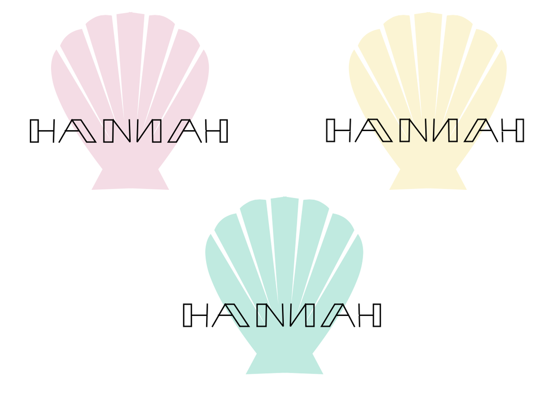 I decided to make this logo because I've always enjoyed going to the beach, and a seashell was the first thing that came to my mind when I thought about the beach. This brand is for all sorts of coastal things, mainly seashells. This logo is a seashell, but not an extremely intricate one. It is simple, but recognizable to be a shell. My favorite logo that I did was the teal one, because it's my favorite color. 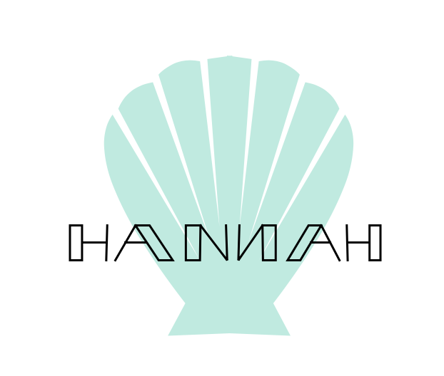
0 Comments
For this assignment, there were two tasks: creating colors in a constant shape and recording their HEX codes and color values (Color Names), and using Adobe Color to create different color combinations (Color Schemes), both using Gravit. For the first portion, I traced an image of the Space Needle in Seattle, Washington. Using what I traced, I recolored certain parts of the building. Then, I used the Adobe color mixer to make color combinations and find their HEX values and color values. I created an image of a polaroid, which was just a rectangle and a square, with more empty space below the rectangle. With the help of Adobe Color, I made one monochromatic color scheme, an analogous color scheme, one complementary color scheme, and one triadic color scheme. Adobe Color gave me the HEX codes as well as the colors, so I just copied and pasted them below each polaroid. Color Names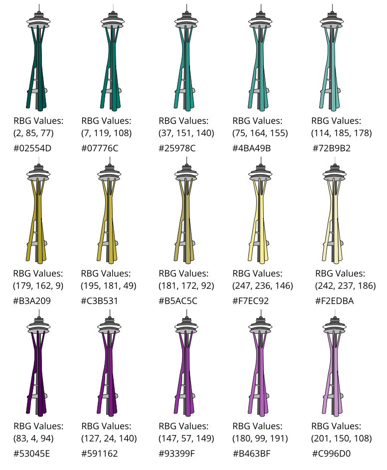 Color Schemes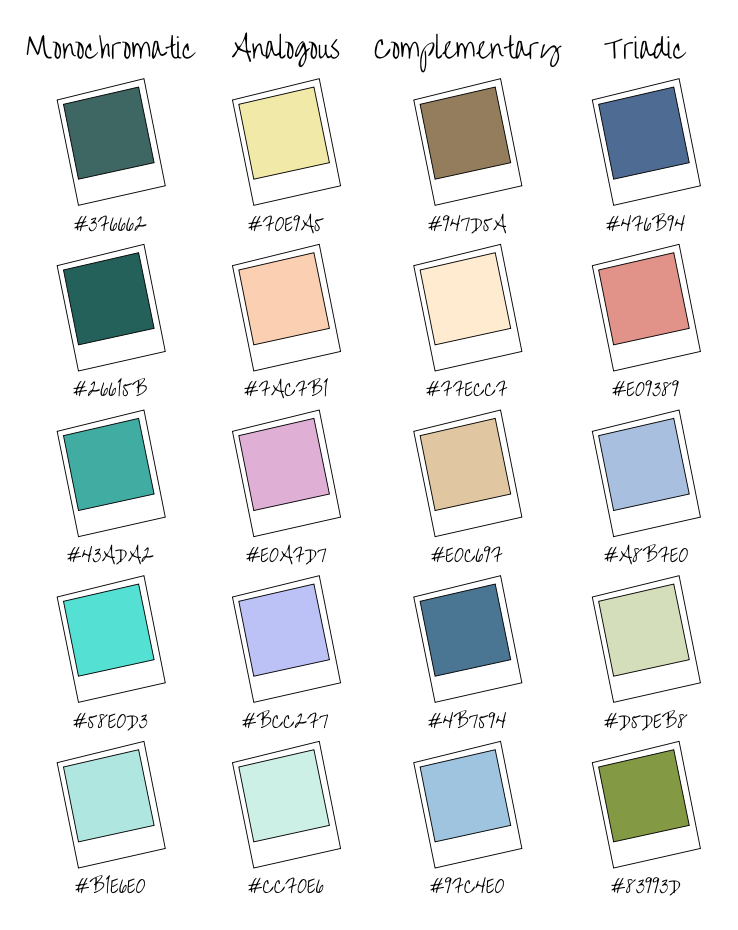 The last few classes, we have been learning about typography, which is the visual component of a written word. Typography helps with graphic design, and a design needs to convey a certain message, preferably the most prominent part being larger and standing out. If someone doesn't know about typography, something could be hard to read, or it could give the wrong idea. "Each font has a personality and a purpose." This was a quote that we focused on while learning about Typography, and it means that all fonts have a unique way they look, and a special theme they should be used for. The five types of fonts are serif, sans serif, monospaced, script/handwritten, and display. Serif has "feet" and is usually used in print. Serif is used in newspapers. Sans serif doesn't have "feet" and is used for titles and headings. Monospaced is where each letter takes up the same amount of space, for example, a wide letter like the letter "w" will take up the same amount of space as a skinnier letter, such as the letter "i." Monospaced fonts are used for coding. Script fonts are designed to look like handwriting and are hard to read. Script is used for details and logos. Display fonts are to be used scarcely, and they're flashy and good at catching people's attention. Display fonts are used for posters. typeface COmparison For this assignment, we were told to write the same word or phrase five times, using the five different types of fonts. I used the word "typewriter" and used what I knew about graphic design to align the words. 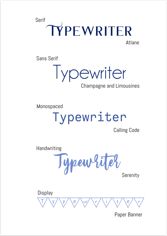 word portraits This assignment was to use different fonts that show different "personalities" and find two words for each font, one that fit the font, and one that didn't. There were a total of 10 fonts and 20 words. 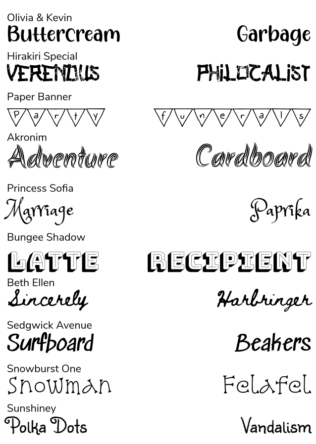 In the past few classes, we learned how to use the Pen Tool on Gravit. The Pen Tool is mostly used to trace images, or crop certain elements of them out. The Pen Tool can also be used to make custom shapes as well. First, we were assigned to trace a collection of superhero logos. The work that I did is shown in the first image down below. Then, we were to trace Abraham Lincoln off of the standard American penny and use Lincoln's head to make a black silhouette. Our final assignment was to find two or more different images on the internet and cut them out to make one unique image. I used different coastal images to create an image of sea creatures above the sea line and boats and seagulls under the sea line. One problem I encountered was that the connected paths would curve in strange and unintended ways. I used the sub-select pointer to re-establish the intended curves, and, in the end, everything ended up appearing the way I planned. I used these links: Sunset, Sea, Turtles, Clownfish, Sailboats, Seagulls. 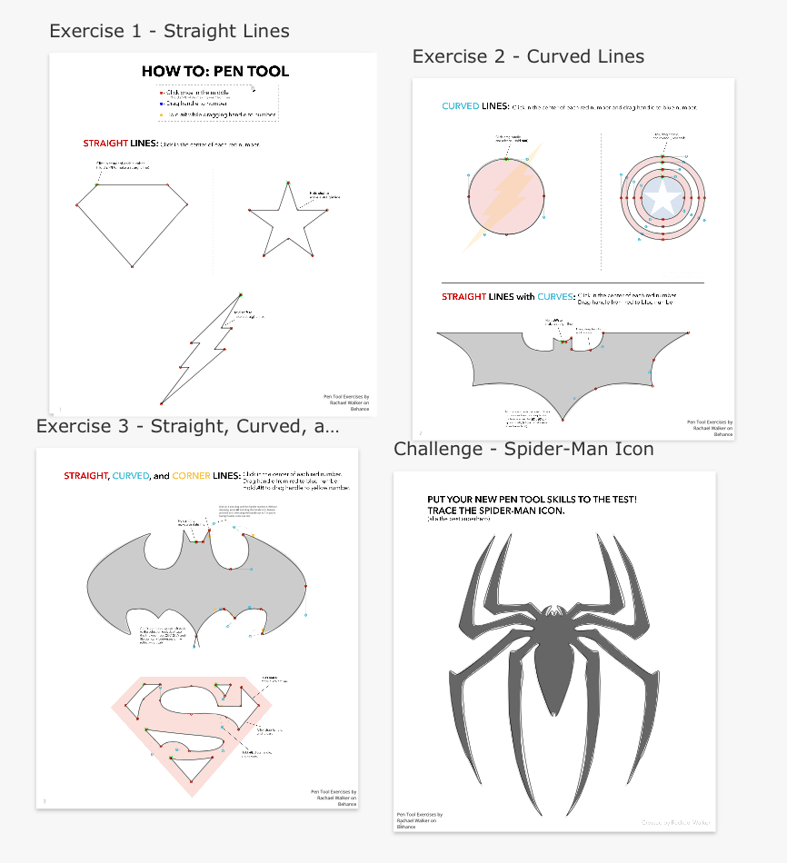 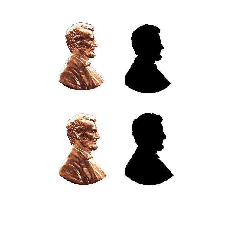 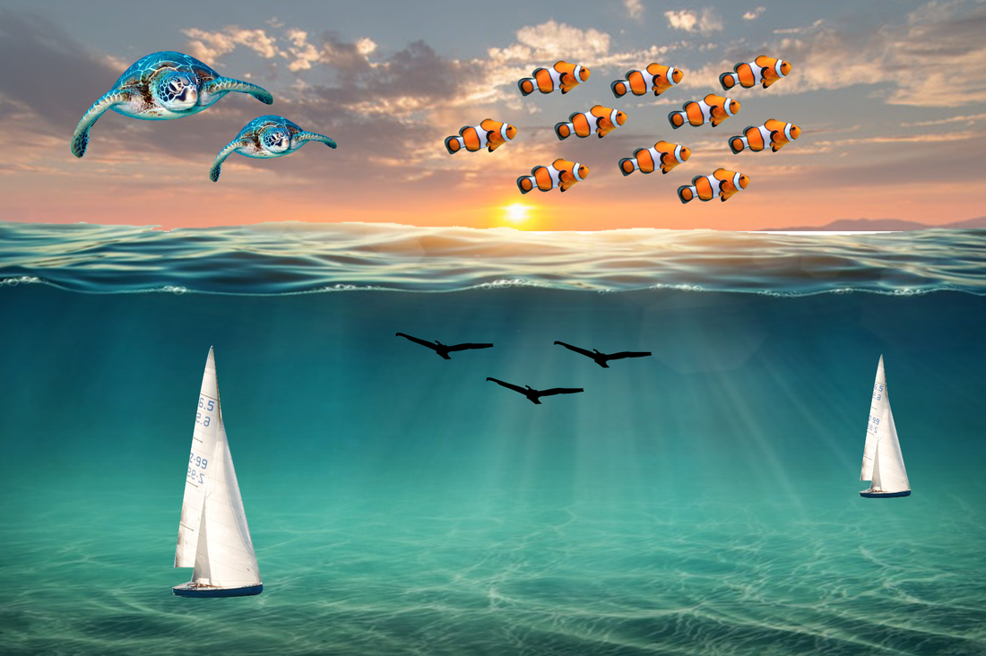 Today, we were assigned to use what we knew about creating shapes in Gravit and create a complex and unique illustration that portrayed something meaningful to us. We were only allowed to use a certain six shapes, and the other shapes that were needed to create this image were shapes that were converted into paths, which lets you modify the shape's points, curves, and angles. This illustration is important to me because I really enjoy art, and the original painting, which I used for reference, was the first ever painting that I duplicated when I was nine or ten years old. You can check out the original painting using this link: Lilacs and Roses by Edouard Manet. 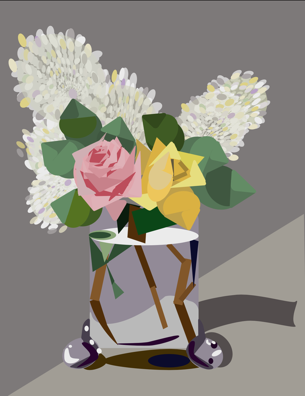 In today's class, we learned how to edit the corners of shapes to make them as round or sharp as we wanted using Gravit. The higher numerals in the corner setting make a more circular shape, which the lower numerals have a more sharp-cornered shape. I practiced this with squares, triangles, polygons, and stars. After, I created two shapes and copied and pasted them. I used the four different merging tools: union, subtract, intersect, and difference. 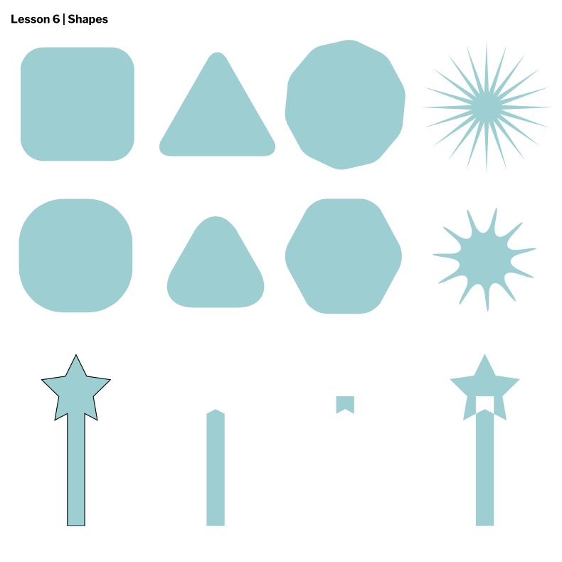 Today, we learned how to use layers and groups in Gravit. Layering was helpful in the sense that I could easily control which shapes I wanted to be in front of others, which was something I already knew a little bit about from using Google Slides. Grouping made the left-hand sidebar more organized, as we could see all the elements but in certain categories with other elements. Aligning made everything exact and parallel to edges or the center of a page. 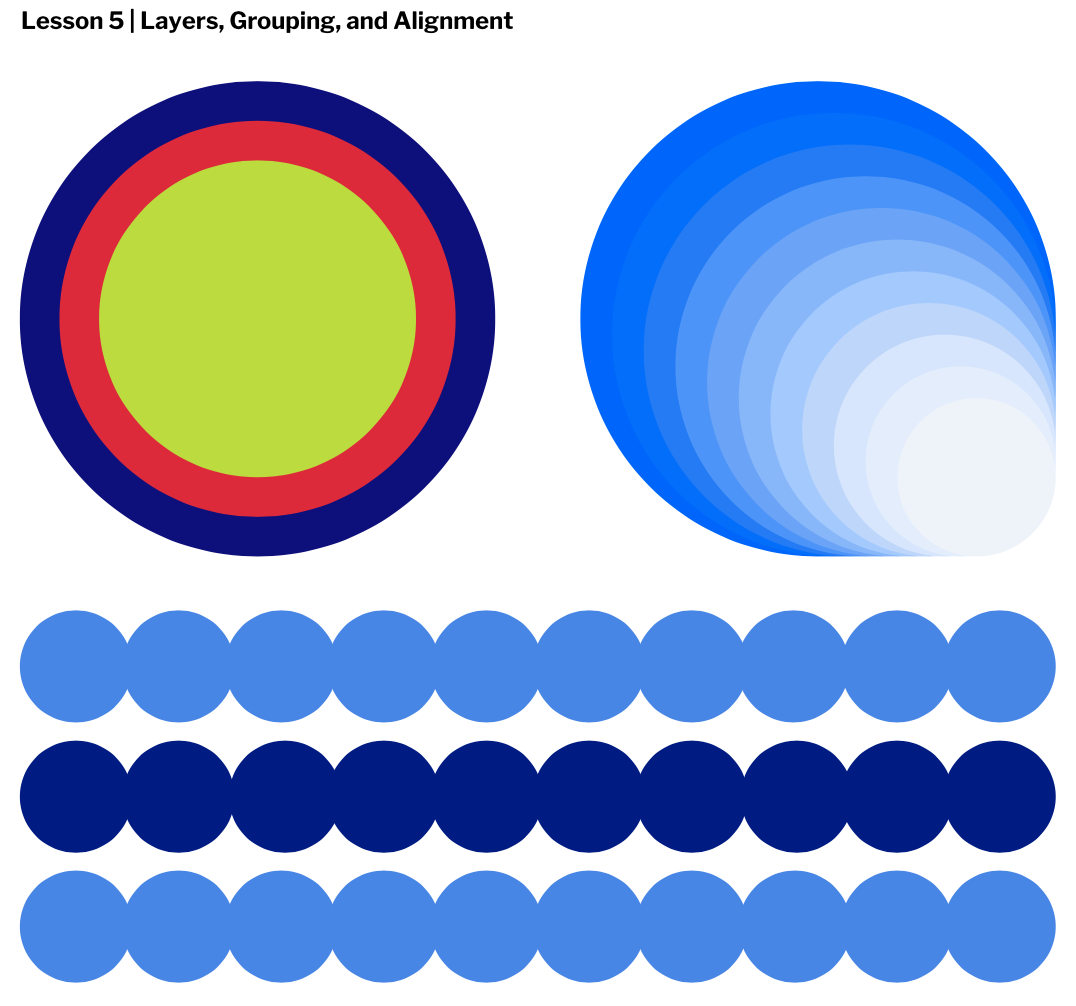 Today, we learned how to fill and border shapes in Gravit. "Fill" is to change the color or opacity of the shape. "Border" is when we apply a border that surrounds the shape with a certain color of your choice and thickness. The borders can be dashed, and a border can even be applied and made invisible. I used the fill tool to make my shapes different shades of blue, and I used the border tool to make black borders around my shapes. 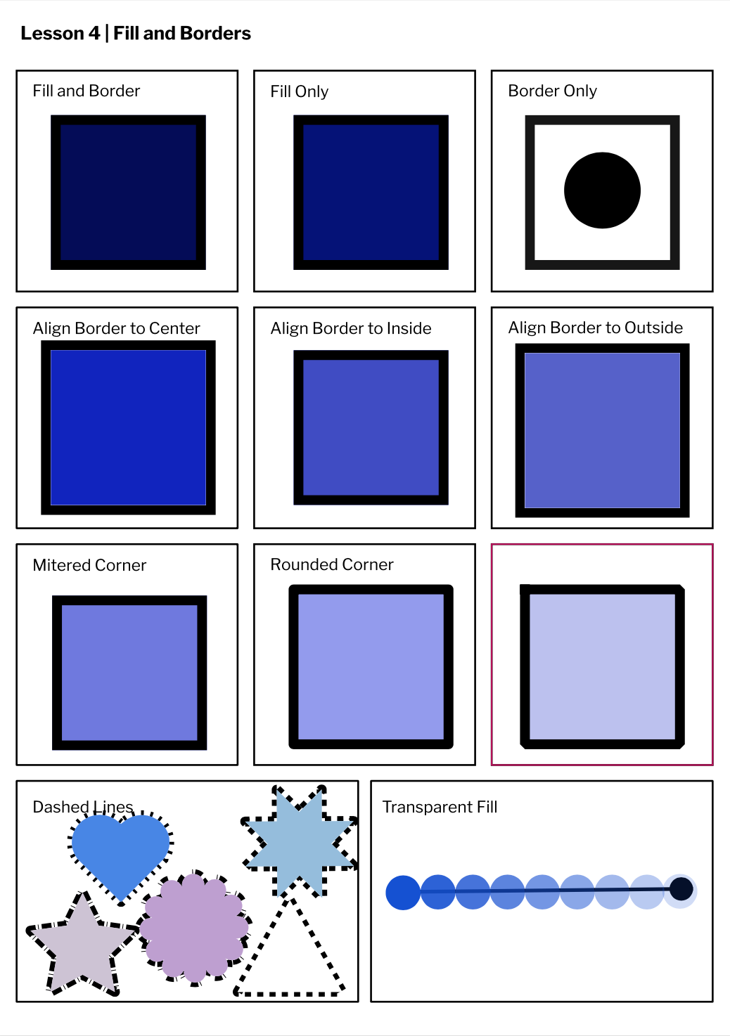 Today, we used the same program, Gravit, to create various different geometrical shapes. Since I had previous experience from the last assignment, using Gravit was easier today than it was last class. There were different pointers to use to create and edit different shapes. We learned all of the keyboard shortcuts and tools. For example, pressing shift while creating shapes will give you more control to create a more exact shape. 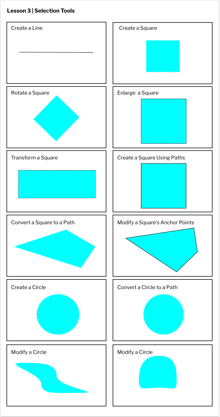 In this class, we used gravit.io to learn how to make different sized pages. Custom colors and text boxes could be applied to this pages, and we learned just how to create those things. We created a custom page, a standard A4 page, an A3 landscape page, and a blog cover page. These pages had different dimensions, either in pixels or millimeters, but there were other measurements to choose from. There were ways to center elements, or make them sit on the right or the left. At first Gravit was a little difficult to figure out, but after I had some experience, it was easy and fun to use. 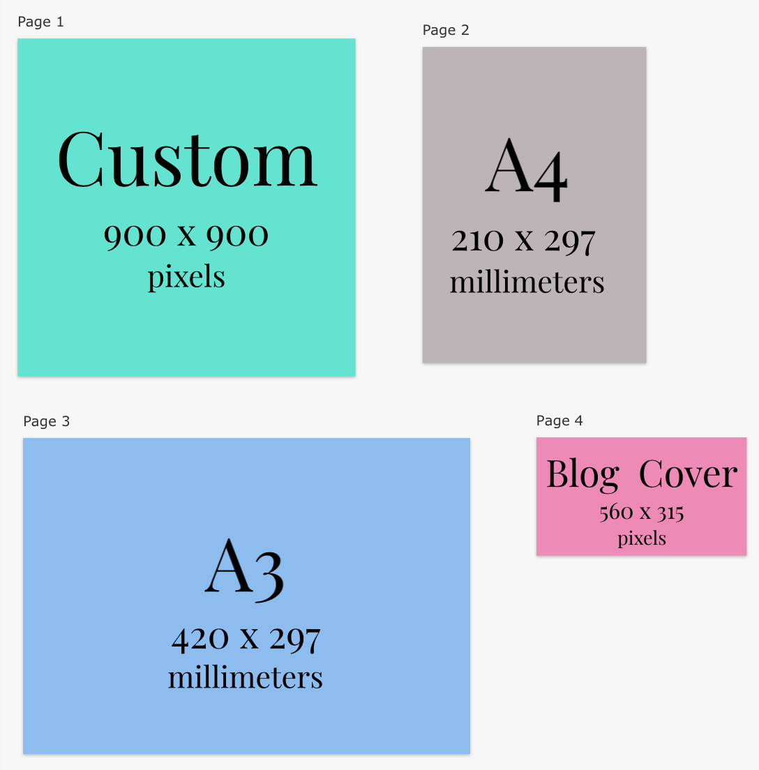 |
AuthorHi, I'm Hannah. I'm writing a blog for Technology Class. Archives
May 2021
 This work is licensed under a Creative Commons Attribution-NonCommercial-NoDerivatives 4.0 International License. |
 RSS Feed
