|
Today, we were asked to complete three logos on Gravit, more specifically, three identical logos with small changes in each one. The first thing I thought of to make a logo of was a seashell. I used the pen tool to make half a seashell, then mirrored it to complete the full shell. Then, I recreated a font (one that I have been using for a long time) with the pen tool, spelling out my name. Since my name is a palindrome, meaning that it spells the same thing from the first letter to the last letter, and vise versa, I was able to mirror the first half of my name to create the second half. However, the 'N' was backwards, and I liked it that way, so I didn't flip it back to a proper 'N.' Finally, I put my name in front of the seashells, each seashell a different color. I think the most frustrating thing that I had to do for this assignment was getting the pen tool to create the small slivers in the shell. Simply zooming in closer to the drawing made this easier. 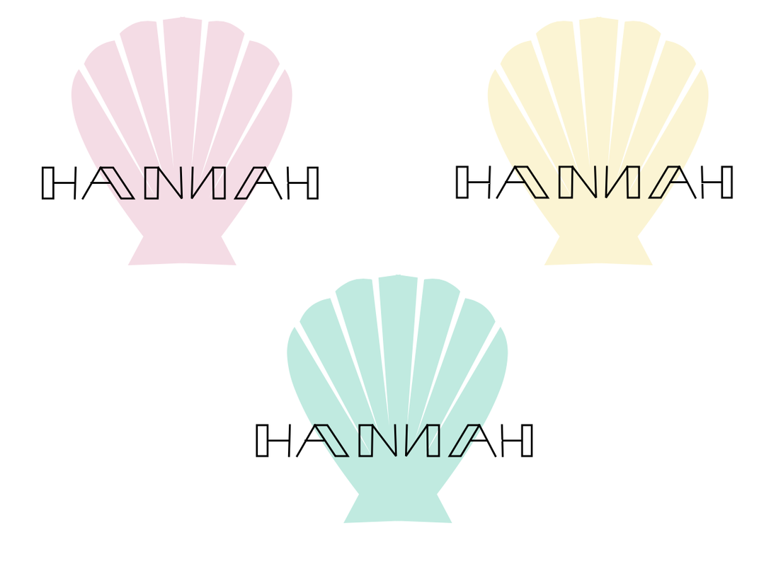 I decided to make this logo because I've always enjoyed going to the beach, and a seashell was the first thing that came to my mind when I thought about the beach. This brand is for all sorts of coastal things, mainly seashells. This logo is a seashell, but not an extremely intricate one. It is simple, but recognizable to be a shell. My favorite logo that I did was the teal one, because it's my favorite color. 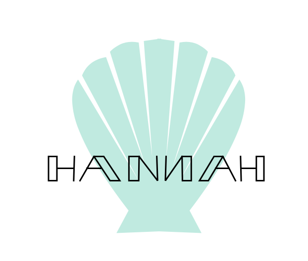
0 Comments
For this assignment, there were two tasks: creating colors in a constant shape and recording their HEX codes and color values (Color Names), and using Adobe Color to create different color combinations (Color Schemes), both using Gravit. For the first portion, I traced an image of the Space Needle in Seattle, Washington. Using what I traced, I recolored certain parts of the building. Then, I used the Adobe color mixer to make color combinations and find their HEX values and color values. I created an image of a polaroid, which was just a rectangle and a square, with more empty space below the rectangle. With the help of Adobe Color, I made one monochromatic color scheme, an analogous color scheme, one complementary color scheme, and one triadic color scheme. Adobe Color gave me the HEX codes as well as the colors, so I just copied and pasted them below each polaroid. Color Names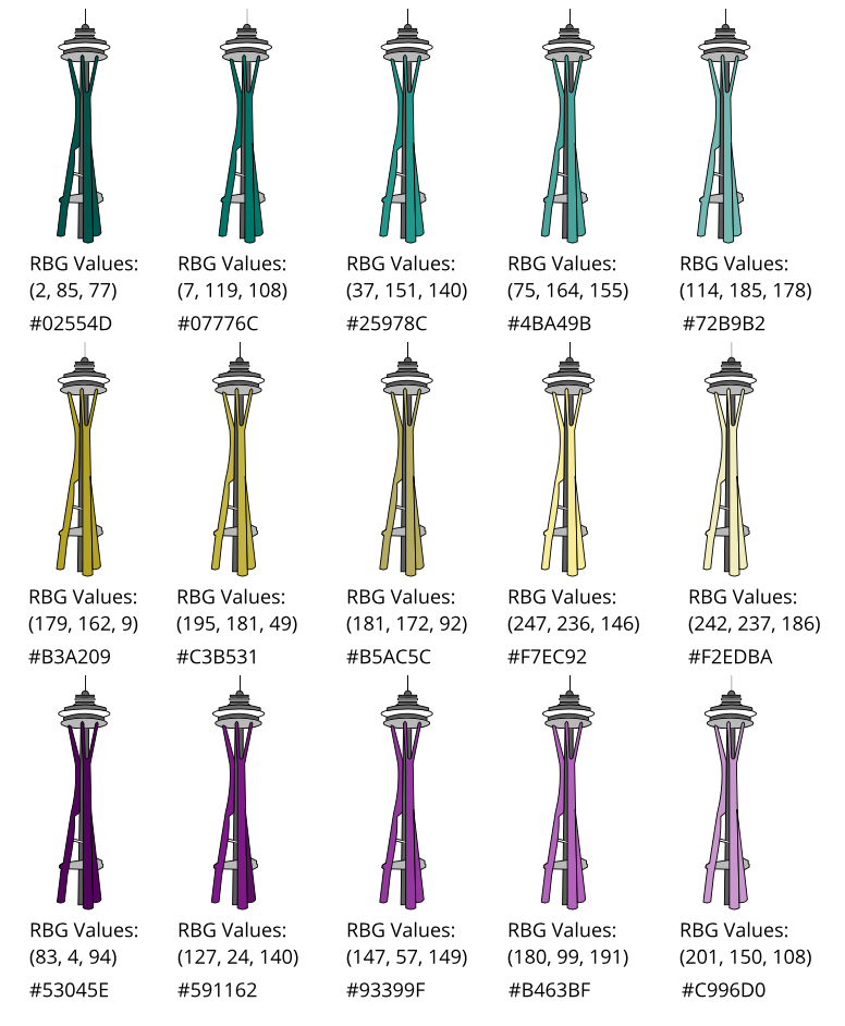 Color Schemes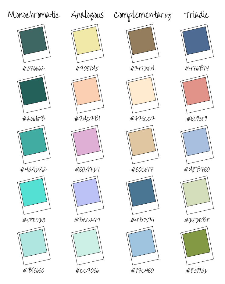 The last few classes, we have been learning about typography, which is the visual component of a written word. Typography helps with graphic design, and a design needs to convey a certain message, preferably the most prominent part being larger and standing out. If someone doesn't know about typography, something could be hard to read, or it could give the wrong idea. "Each font has a personality and a purpose." This was a quote that we focused on while learning about Typography, and it means that all fonts have a unique way they look, and a special theme they should be used for. The five types of fonts are serif, sans serif, monospaced, script/handwritten, and display. Serif has "feet" and is usually used in print. Serif is used in newspapers. Sans serif doesn't have "feet" and is used for titles and headings. Monospaced is where each letter takes up the same amount of space, for example, a wide letter like the letter "w" will take up the same amount of space as a skinnier letter, such as the letter "i." Monospaced fonts are used for coding. Script fonts are designed to look like handwriting and are hard to read. Script is used for details and logos. Display fonts are to be used scarcely, and they're flashy and good at catching people's attention. Display fonts are used for posters. typeface COmparison For this assignment, we were told to write the same word or phrase five times, using the five different types of fonts. I used the word "typewriter" and used what I knew about graphic design to align the words. 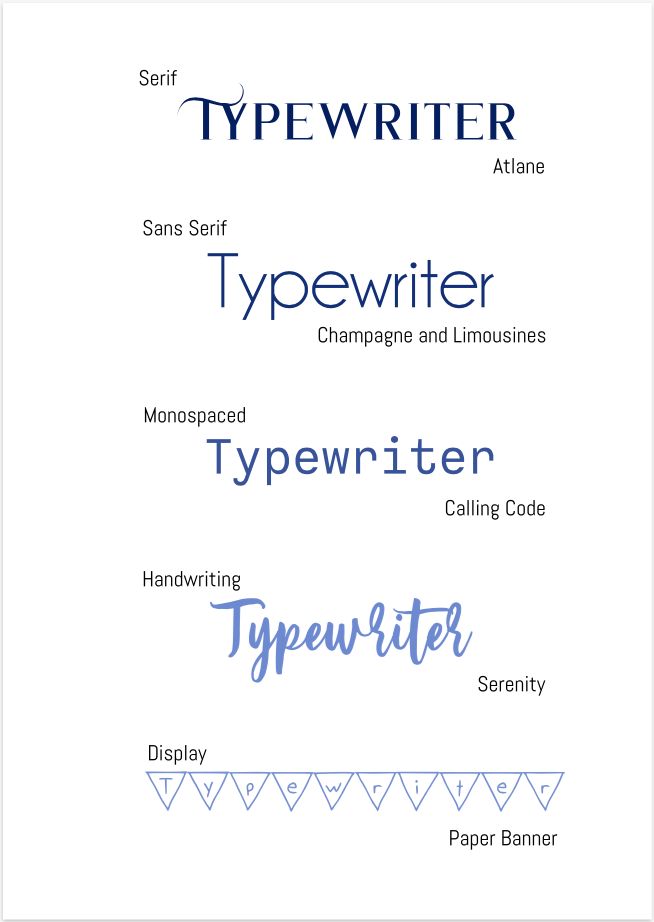 word portraits This assignment was to use different fonts that show different "personalities" and find two words for each font, one that fit the font, and one that didn't. There were a total of 10 fonts and 20 words. 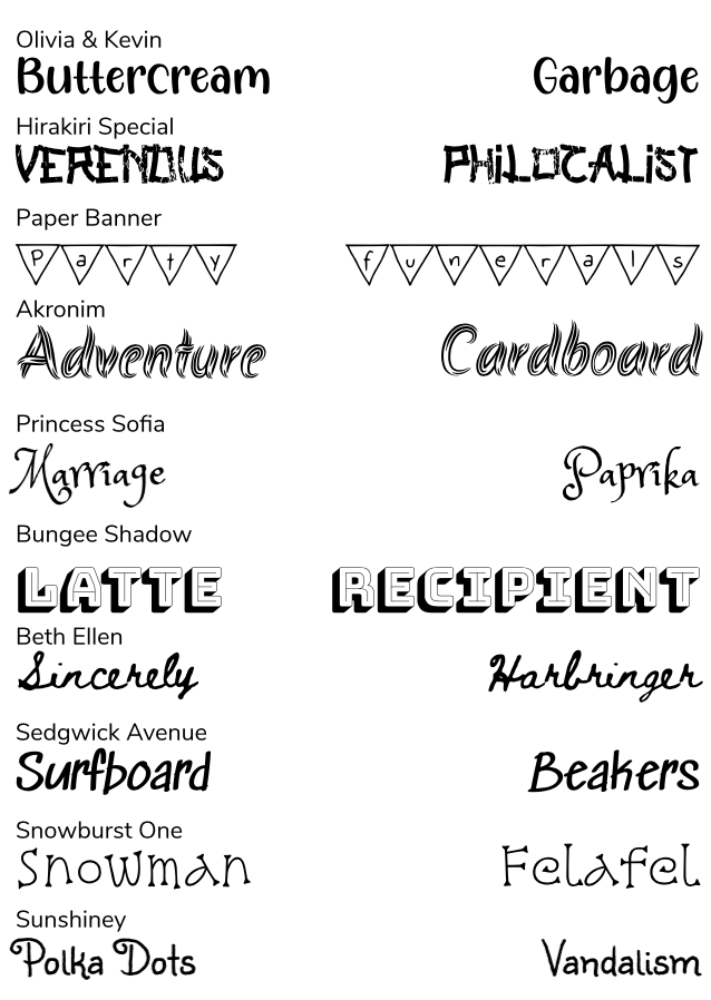 Today, we used the same program, Gravit, to create various different geometrical shapes. Since I had previous experience from the last assignment, using Gravit was easier today than it was last class. There were different pointers to use to create and edit different shapes. We learned all of the keyboard shortcuts and tools. For example, pressing shift while creating shapes will give you more control to create a more exact shape. 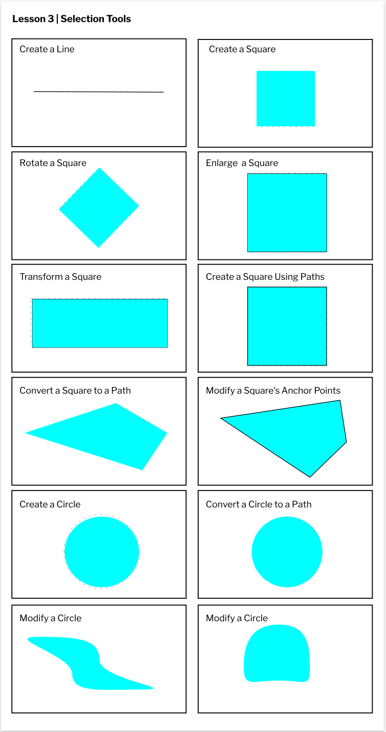 In this class, we used gravit.io to learn how to make different sized pages. Custom colors and text boxes could be applied to this pages, and we learned just how to create those things. We created a custom page, a standard A4 page, an A3 landscape page, and a blog cover page. These pages had different dimensions, either in pixels or millimeters, but there were other measurements to choose from. There were ways to center elements, or make them sit on the right or the left. At first Gravit was a little difficult to figure out, but after I had some experience, it was easy and fun to use. 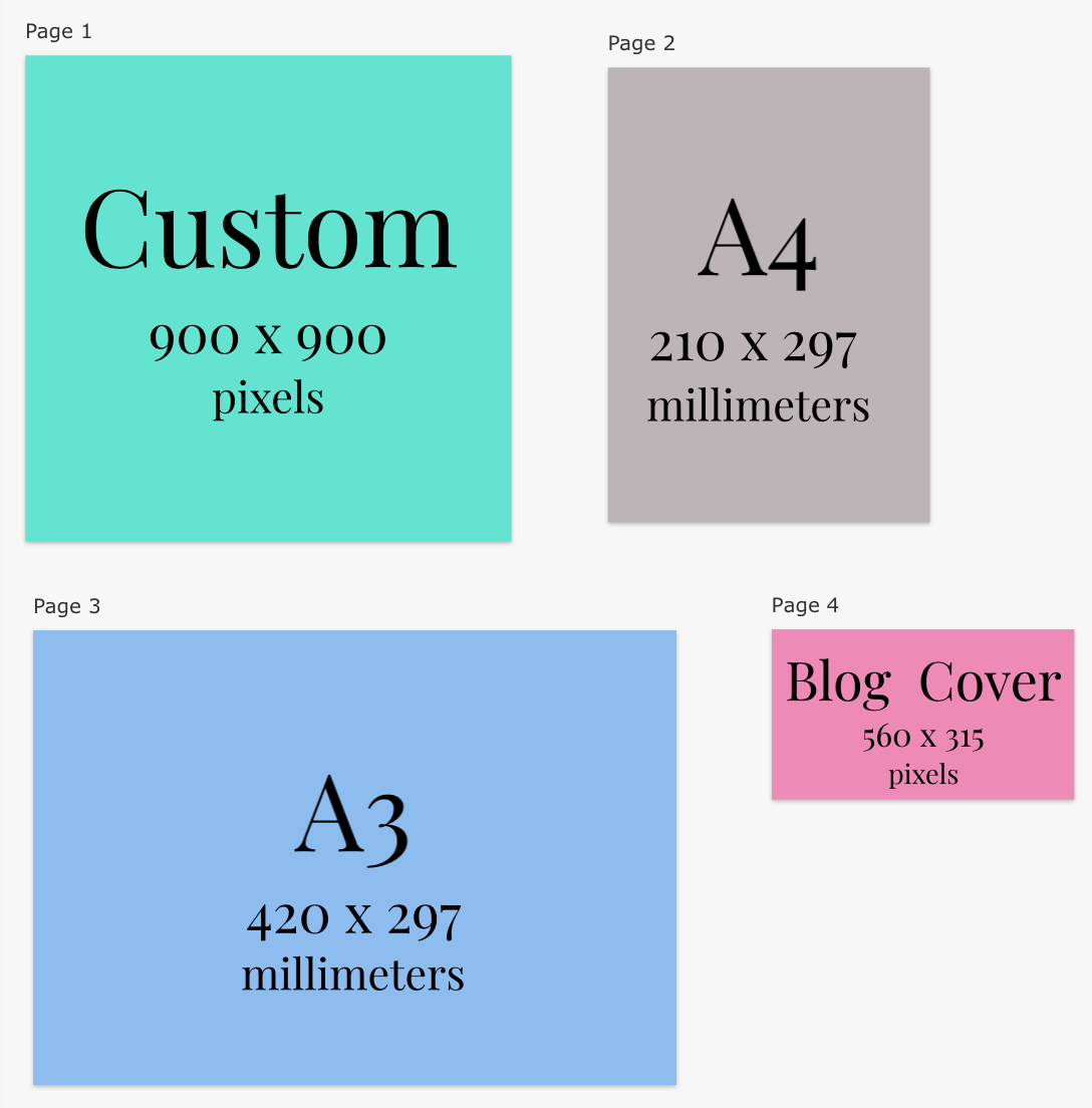 I don't know very much about graphic design, as the only things I have ever used graphic design for are slideshows and photographs. I know that graphic design is a way of communication or art made through technology. I have made numerous slideshows and posters through google slides. I have learned and studied how to make an effective presentation, one that people will pay attention to. With photographs, I like to have one focus on my subject and a slightly blurred background behind it.
|
AuthorHi, I'm Hannah. I'm writing a blog for Technology Class. Archives
May 2021
 This work is licensed under a Creative Commons Attribution-NonCommercial-NoDerivatives 4.0 International License. |
 RSS Feed
